80 free guides 277 fonts

Fonts, done right · 2026

Find fonts that actually fit your brand.

Practical, tested font pairings and free downloadable packs for logos, branding, weddings, and craft projects — no design degree required.

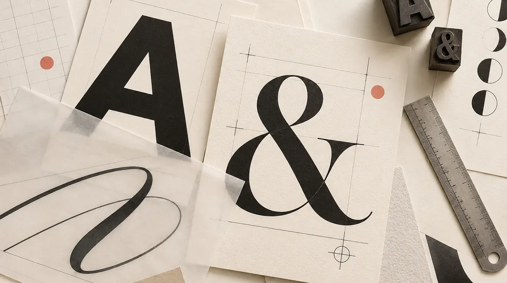
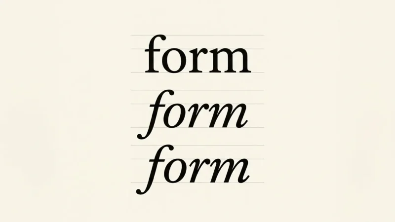
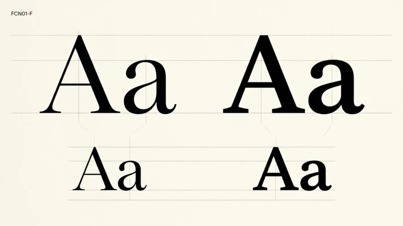
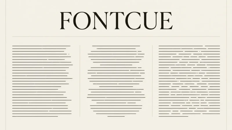
Curated typography specimens with contrasting letterforms, layout guides, and letterpress blocks

fig. 01 · a pairing either reads as a decision, or an accident.

guides80 topicspairing · branding · free fonts costfree, always updatedweekly statusgrowing
02

Latest articles

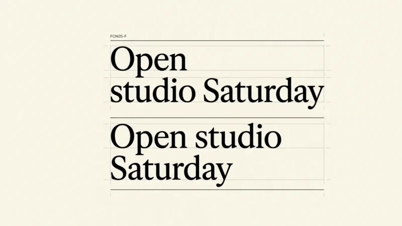
Line Breaks and Hyphenation: Fix Awkward Headings and Narrow Columns

Line Breaks and Hyphenation: Fix Awkward Headings and Narrow Columns

Use line breaks and hyphenation to fix awkward headings and narrow columns. Compare manual breaks, long links and responsive text without hiding the content.

Font Fallback and Layout Shifts: Why Website Text Jumps as It Loads

Font Fallback and Layout Shifts: Why Website Text Jumps as It Loads

Understand font fallback and layout shifts on websites. Learn why text changes after loading and how to check fallback faces, wrapping and delivery behavior.

Tabular vs. Proportional Numbers: Clear Prices, Tables and Timers

Tabular vs. Proportional Numbers: Clear Prices, Tables and Timers

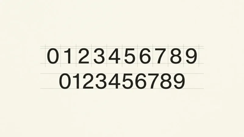
Compare tabular vs proportional numbers for tables, prices and timers. Learn how width differs from figure height and check the digits in your actual font.

Italic vs. Oblique Fonts: Choosing Emphasis That Stays Readable

Italic vs. Oblique Fonts: Choosing Emphasis That Stays Readable

Compare italic vs oblique fonts for emphasis, captions and quotations. Check real italic styles, simulated slants and how the text reads at its final size.

Optical Size in Fonts: Why Text and Display Cuts Look Different

Optical Size in Fonts: Why Text and Display Cuts Look Different

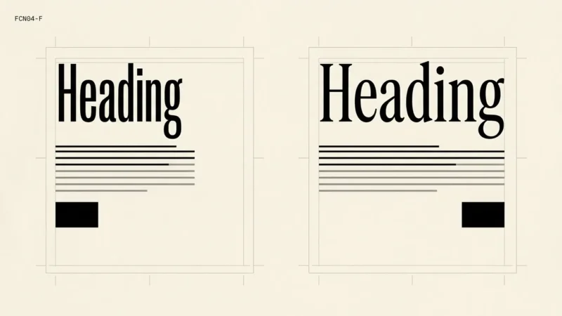
Understand optical size in fonts and compare text and display cuts. Check small captions, large headings and variable font settings at their final size.

7 Best Calligraphy Fonts for Invitations, Signs and Logos in 2026

7 Best Calligraphy Fonts for Invitations, Signs and Logos in 2026

Seven Creative Fabrica calligraphy fonts compared for invitations, signs and logos, with print checks, swash tips and the drawback of each pick.

Font Legibility: How to Tell Similar Letters and Numbers Apart

Font Legibility: How to Tell Similar Letters and Numbers Apart

Check font legibility with similar letters and numbers such as I, l, 1, O and 0. Build a useful sample before choosing type for labels, codes and body text.

Text Alignment for Readability: Left, Centered or Justified?

Text Alignment for Readability: Left, Centered or Justified?

Choose left, centered or justified text for articles, invitations and short headings. Compare alignment, word gaps and wrapping at the final reading size.

03

Why FontCue

  1. P·1

    Tested, not trendy

    Every pairing runs through the same 4-step checklist before it's published — contrast, spacing, scale, legibility.

  2. P·2

    Free, always

    Every downloadable pack and checklist is free. No paywalled "pro" tier hiding the fonts that actually work.

  3. P·3

    Built for real sizes

    A pairing that only works on a 27-inch monitor isn't done. Every guide checks the size it will actually ship at.

Get new guides in your inbox

One email a week, whenever a new pairing guide or font pack drops. No spam.